Project Overview
Objective: This project aimed to redesign the diving website's landing page to elevate user engagement and significantly boost conversion rates. The focus was on creating an immersive experience, simplifying the user flow, and enhancing the overall visual hierarchy to make the website more appealing and easier to navigate.
Methodology: Design Thinking
My Role: UX/UI Designer
Time Duration: 3 weeks
People: 1
Techniques: Desk Research, Interviews, Empathy, Wireframes, Prototypes, Design System
Tools Used: Google Forms, Figma, Illustrator
Initial Design Analysis
Strengths: The original design clearly segmented important information such as pricing, diving courses, and contact forms, making it easy for users to locate the basic offerings.
Weaknesses: The imagery was less engaging, failing to capture the adventurous essence of diving. CTAs (Call-to-Actions) were scattered throughout the page, making the navigation process disjointed. Furthermore, the content-heavy layout resulted in cognitive overload, making it hard for users to digest key information efficiently.
Redesign Goals
Enhance Visual Appeal and User Engagement: Create a captivating visual experience that resonates with diving enthusiasts.
Simplify the User Flow: Streamline users' path from landing on the page to converting.
Focused and Effective CTA: Implement a prominent, single CTA that drives conversions more effectively.
Key Changes & Improvements
Visual Hierarchy and Layout
Before: The previous segmented layout presented users with dense information right from the start, diluting the impact of the visual elements.
After: We shifted to a fluid layout, introducing a large, immersive hero image as the page's focal point. This not only draws the user in but also immediately conveys the allure of diving.
Imagery
Before: Smaller, less impactful images that did not inspire action.
After: The redesign features bold, high-quality imagery that captures the underwater beauty and excitement of diving, forming an emotional connection with the user from the outset.
Call to Action (CTA)
Before: The CTAs were scattered, making it harder for users to identify the primary action they should take.
After: A consolidated and prominent CTA now directs users clearly toward conversion goals, such as booking a course or requesting more information.
Information Density
Before: Users were overwhelmed by a wall of text and detailed information, leading to decision paralysis.
After: We streamlined the content by focusing on visual storytelling first. The heavy information is now hidden behind relevant CTAs or further down the page, making the initial interaction more engaging and less daunting.
Form Placement
Before: The form was integrated into the main content, contributing to information overload.
After: The form is now accessible through the CTA, encouraging users to engage with the content first before committing to a course or making an inquiry.
Key UX/UI Design Fundamentals Applied
Enhanced Visual Engagement
We utilized larger, immersive images to connect emotionally with users, drawing them into the underwater world of diving.
We utilized larger, immersive images to connect emotionally with users, drawing them into the underwater world of diving.
Simplified User Flow
By consolidating information and prioritizing the user’s decision-making process, we reduced cognitive load and guided them toward conversion with ease.
By consolidating information and prioritizing the user’s decision-making process, we reduced cognitive load and guided them toward conversion with ease.
Clear Call to Action
A consolidated, highly visible CTA makes it easy for users to understand what action to take next, leading to more effective conversions.
A consolidated, highly visible CTA makes it easy for users to understand what action to take next, leading to more effective conversions.
Modern Aesthetic Appeal
Clean, modern design principles ensured the page is not only functional but also visually appealing, enhancing the user experience.
Clean, modern design principles ensured the page is not only functional but also visually appealing, enhancing the user experience.
Focused Content Delivery
We shifted the focus from dense information to engaging storytelling, creating a narrative that resonates with the audience’s sense of adventure.
We shifted the focus from dense information to engaging storytelling, creating a narrative that resonates with the audience’s sense of adventure.
Cenotes Pages Comparison (old vs. modified )
1- Improved Information Architecture:
Old (left): Limited, unstructured info about cenotes.
New (right): Organized sections ("What are cenotes?" and "Why do people like them?"), enhancing clarity and flow.
2- Better Visual Hierarchy:
Old: Competing visual elements hurt readability.
New: Clear headings and structured content make the layout intuitive and easy to follow.
3- Optimized Layout & Content Density:Old: Large contact form wastes space.
New: Balanced layout with more upfront info and a smoother flow toward action.
4- Enhanced CTA Placement:
Old: "Schedule Now" CTA feels abrupt and isolated.
New: CTAs are logically placed at the end, improving conversions.
5- More Engaging Content:
Old: Minimal explanation of cenotes.
New: Detailed, SEO-friendly content boosts engagement and discoverability.
Landing Pages Comparison (old vs. modified):
1- Visual Hierarchy & Engagement:
Old (left): Static images in the hero section, with the form dominating the center.
New (right): The hero is followed by engaging video content and certification info, highlighting key offerings and creating a more immersive experience.
2- Call to Action Enhancement:
Old: "Schedule Now" CTAs lacked emphasis.
New: More prominent CTAs like "Get your certification" and "Experience the magic" are now aligned with relevant content, increasing user engagement and clarity of next steps.
3- Content Structure & Flow:
Old: Minimal content variety, with an overly prominent contact form.
New: Optimized flow combining video, text, and images, guiding users smoothly from exploration to action. The form has been replaced with richer content, and contact options are moved to the bottom.
4- Improved Layout & Image Use:
Old: Static images without a storytelling focus.
New: Images now enhance storytelling, showcasing unique dive experiences, making the page visually appealing and interactive.
Snorkel Pages Comparison (old vs. modified):
1- Improved Visual Hierarchy:
Old (left): Images felt disconnected from the surrounding content.
New (right): Larger, aligned images now enhance both readability and user engagement.
2- Better Layout & Flow:
Old: The contact form disrupted the content flow.
New: The form is moved to the bottom, allowing greater focus on snorkeling packages.
3- Stronger CTA Placement:
Old: CTAs were less prominent and easily overlooked.
New: Clearer and better-positioned CTAs drive user action more effectively.
About Pages Comparison (old vs. modified):
1- Content Structure:
Old (left): Focused solely on team experience.
New (right): Expanded with sections like "Why Us?" and "Our Location," offering richer, more comprehensive information.
2- Team Section Enhancement:
Old: Basic image grid of team members.
New: Includes names, roles, and a structured layout, giving a more polished team presentation.
3- Improved Engagement:
Old: Minimal storytelling with basic text.
New: Adds a brand statement ("Every dive..."), building a stronger emotional connection with users.
Tech Diving Pages Comparison (old vs. modified):
1- Content Organization:
Old: Dense information with little distinction between sections.
New: Clearer sections with improved spacing and a column-based structure, enhancing readability and scannability.
2- Visual Hierarchy:
Old: Course details and theory are blended, reducing clarity.
New: Well-defined sections with enhanced typography for easier content digestion.
3- Icon Use:
Old: Minimal icons with smaller visual cues for excluded items.
New: Larger, more distinct icons improve visual clarity and quick understanding
Additional Marketing Materials
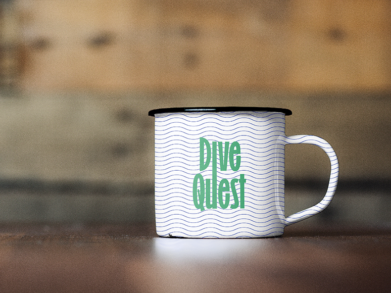
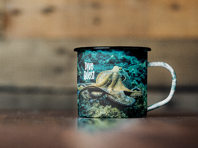
While the Dive Center website was the central focus of my project as a UX designer, effective marketing materials are essential for enhancing the overall customer experience. I also developed a flyer and two digital catalogs to support the dive center's outreach efforts.
The flyer serves as an engaging tool to quickly capture interest, while the digital catalogs provide detailed information about services and safety training. Together, these materials complement the website, reinforcing its messaging and positioning the dive center as a premier destination for diving adventures.
Conclusion
As a UX designer, the key improvements I introduced centered around enhancing the overall user experience:
Content Organization: Structured information into clear, scannable sections, making navigation intuitive and ensuring users can easily find what they need.
Visual Hierarchy: Improved spacing, typography, and layout to establish a clear visual hierarchy, allowing users to focus on key details quickly.
Engagement and Interaction: Boosted call-to-action visibility and streamlined user interactions to guide users effortlessly toward booking or exploring services.
Clarity and Usability: Optimized readability by balancing text and visuals, using icons to clarify non-included features and manage cognitive load.
Consistency: Ensured a unified design language across the website for a seamless, cohesive user experience.
Testimonial From Client
"Working with Leyla has been a blessing. I was overwhelmed with redesigning my website and CRM, but she brought clarity and structure right from the start. Leyla listened carefully, asked the right questions, and quickly got things moving. Her modifications elevated the design far beyond my expectations, blending functionality with stunning visuals. Her creativity, problem-solving skills, and professionalism made the process stress-free and enjoyable. I’m incredibly impressed and can’t wait to work with her again. I highly recommend Leyla to anyone looking for a designer who truly delivers."

