Client Overview
SparkAPT offers a cutting-edge CRM software solution to automate the client management and apartment locating experience for real estate agents and brokers. Our UX project is aimed to increase subscribers and enhance feature awareness, making SparkAPT the go-to tool for real estate professionals seeking efficiency and excellence.
This is a client project I worked on with a team of 2 other UX designers.
"I am confident that this is something we can leverage moving forward to get higher subscription rates and retention."
-SparkAPT Co-Founder-
my role
UX Researcher
UX Designer
team
3 UX designers
2 client leads
1 offshore developer
tools
Figma
FigJam
Maze
Trello
timeline
Overall: 3 weeks
Discovery & Research: 1.5 weeks
Design & Testing: 1.5 weeks
Problem
SparkAPT wanted to increase the number of subscribers to sign up for their software, reduce the churn rate once users sign up, and reduce user confusion of the available features in the software.
Solution
We focused on two areas: the landing page where SparkAPT creates their first impression for potential new subscribers, and the onboarding process for new users to learn about the features available to them once they sign up.
Objective
The objective of this design is to reduce customer churn rate by 10% and expedite the process for customers to explore the software's available features
DESIGN PRECESS
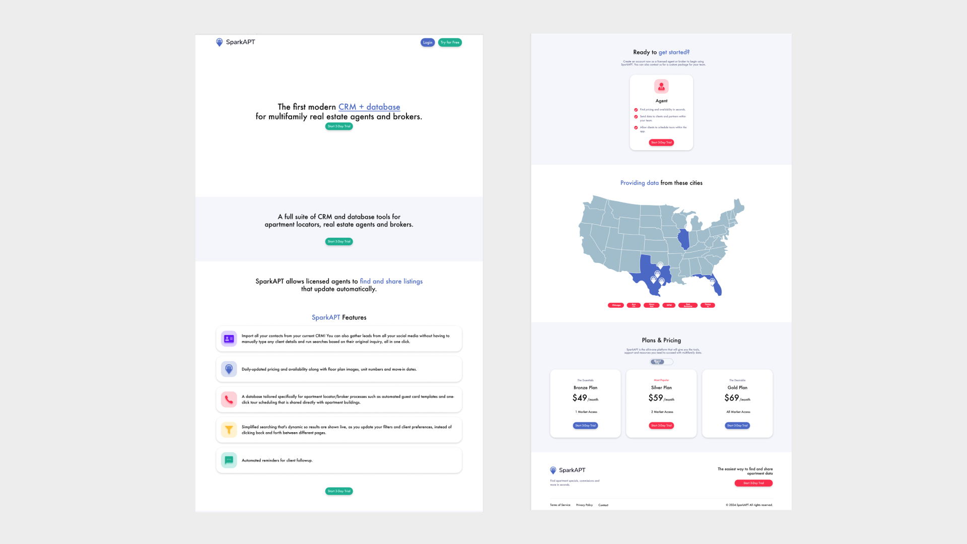
With that in mind, here's a snapshot of what that website looks like currently, when a new user lands on it. the first step that we took in that process was, to begin with research on the current site layout.
Previous
Heuristic evaluation
Conducting a Heuristic Evaluation provided insights into the current state of SparkAPT, particularly focusing on the user experience for first-time visitors eager to sign up.
The top 3 takeaways we learned were:
Tutorials Not Accessible in Software
When a new user signs up, there isn't an existing onboarding process within the software. There are a few tutorial videos that exist, but they get sent externally to anyone who signs up.
Lack of Previews of Functionality
While there are words to describe what the features are, the statements are lengthy with a lack of emphasis on keywords or phrases. There isn't a visual representation of how the functionalities work.
Limited Help & Documentation
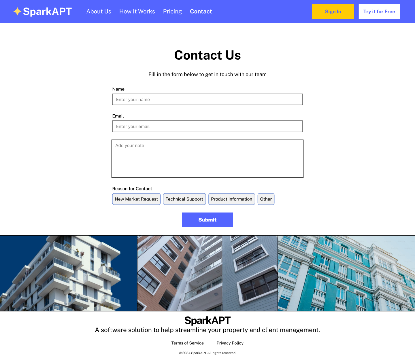
There is limited information that is available for support or questions on the landing page. While there is a contact option located in the footer, it isn't easily visible.
COMPETITIVE AND COMPARATIVE ANALYSIS
Once we had an understanding of the existing state of SparkAPT, we began to analyze our competitors and current market trends and identified gaps and opportunities where SparkAPT could differentiate itself. This informed our strategy to highlight unique features and benefits that would resonate strongly with our target audience.
Landing page
Looking at a competitor landing page example, a few highlights we found were a navigation menu, pricing located on a separate page, credibility established with company metrics and customer feedback, features shown visually, and an area with responses to potential questions.
Looking at comparator landing pages, our biggest takeaway here was we noticed the demonstration of a big bold hero statement next to images to help build a context of what the company and product are.
Onboarding
In terms of onboarding, we found competitors used a variety of ways of wording to encourage users to sign up such as this example of "get started". They also broke out their sign-up process to have emails as the first entry.
Looking at comparators onboarding, we noticed there was a theme of onboarding screens to help guide users through an initial walkthrough of the software immediately after they sign up for the first time. These screens include a visual indication of where they are in the onboarding process, and have the objective of grounding the user on understanding what's included once they sign up.
User Interviews & Contextual Inquiries
We then wanted to gather research from SparkAPT users, which are agents that help their clients find rental apartments.
We conducted 4 remote interviews over Zoom. We asked them to answer some questions about how they manage their workflow, and then share feedback on the existing landing page and software.
INTERVIEW QUESTIONS
Within the software, how would they intuitively approach accomplishing a specific task, such as sending a property to a client?
Based on the landing page, is it clear what SparkAPT does just based on what's provided?
USER RESEARCH INSIGHTS
We learned that:
Agents use a variety of different tools to accomplish their work, mostly from their computers.
Users wanted to see more visuals of a preview of the product features on the landing page.
Users mostly think of SparkAPT as a search tool, and they aren't aware of all the features that are offered.
Users wanted to know where they could go to learn more about the other features within the software.
Persona
Gathering our user research insights, we developed a user persona. Our user persona served as a guide for us to define the user problem, and inform our design solutions to help solve the problem for our user persona, Maria!
Problem Statement
Users need a way to easily understand the benefits of using SparkAPT’s features so that they can find properties and manage their clients more efficiently.
How might we
encourage new users to subscribe to SparkAPT?
How might we
make it easy for new and returning users to understand how to use SparkAPT's features.
User Flow
Taking the how might we questions to solve our user problem statement, we created a user flow to help improve Maria's onboarding experience as a new user.
Sketches
Wireframes
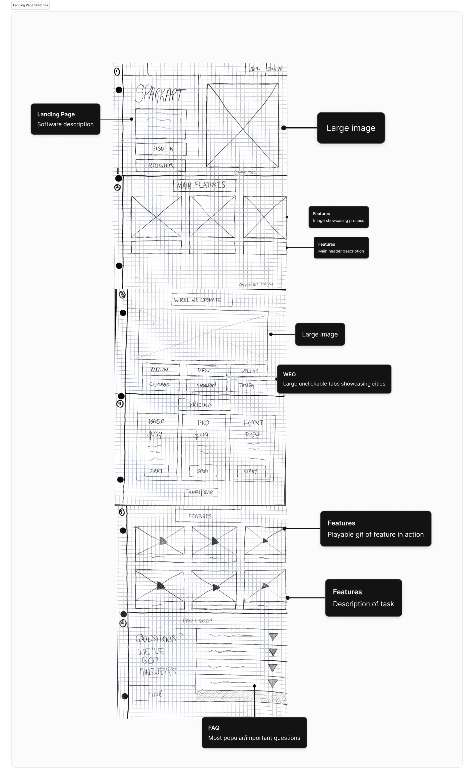
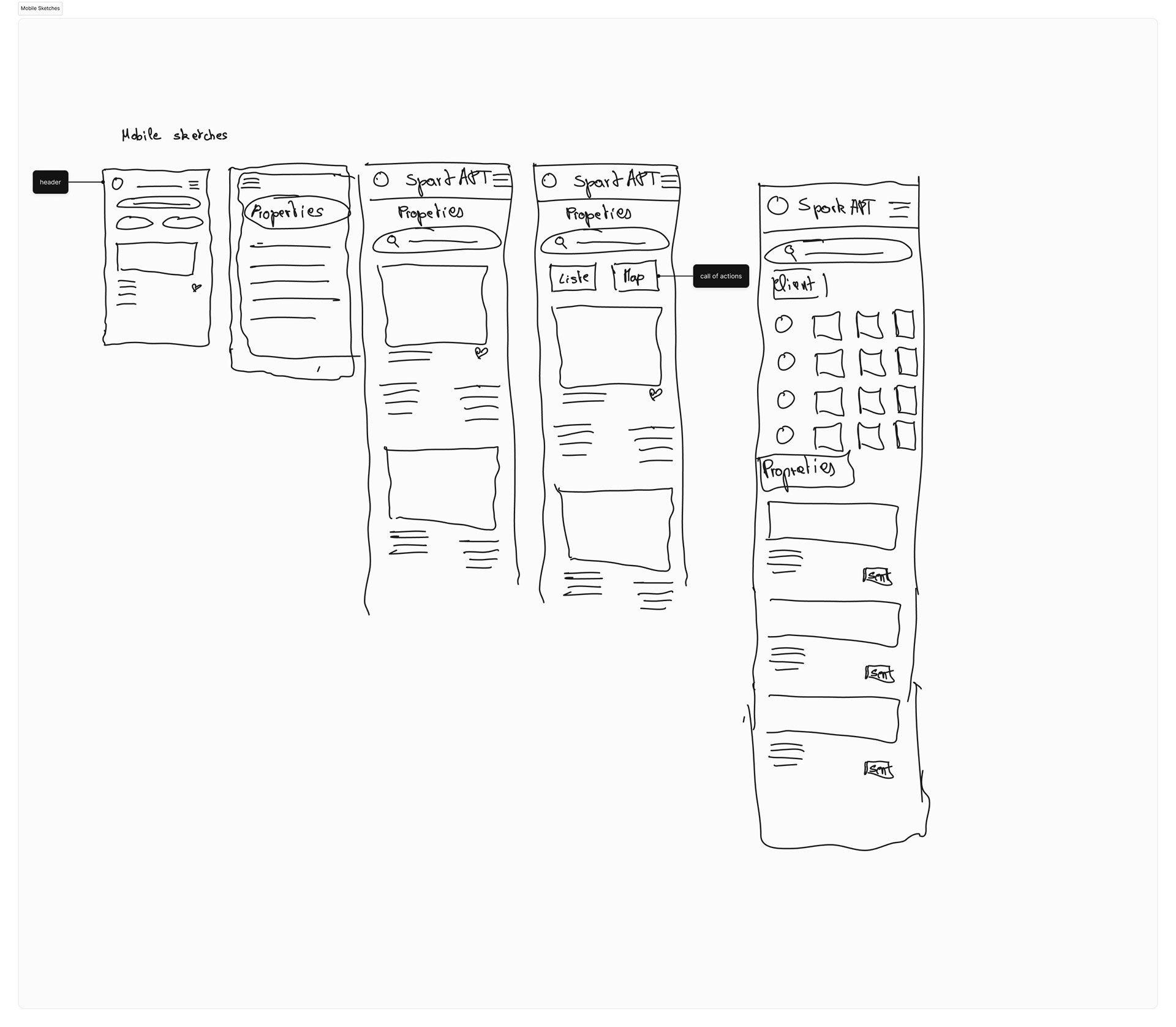
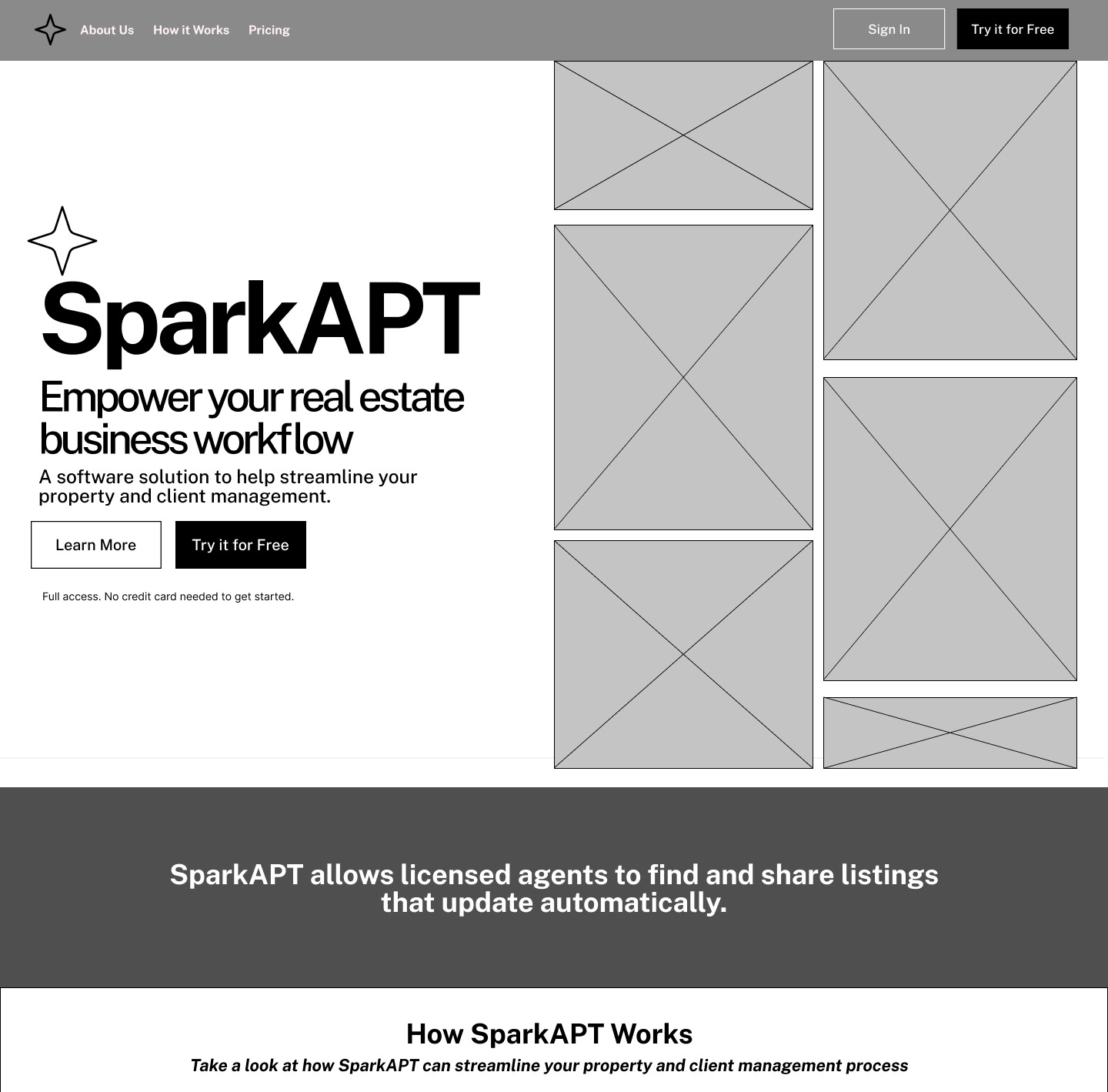
We began the design process with low-fidelity sketches and converted them into wireframes in Figma.
Our objective was to address the significant challenges SparkAPT encountered, achieved through a striking redesign of our landing page, as showcased in the mid-fidelity prototype. This revamped page prominently showcases distinct sections emphasizing the product's attributes, capabilities, and frequently asked questions (FAQs), providing users with a comprehensive overview before they commit to signing up.
Our objective was to address the significant challenges SparkAPT encountered, achieved through a striking redesign of our landing page, as showcased in the mid-fidelity prototype. This revamped page prominently showcases distinct sections emphasizing the product's attributes, capabilities, and frequently asked questions (FAQs), providing users with a comprehensive overview before they commit to signing up.
Furthermore, we dedicated efforts to crafting an onboarding process to assist new users in efficiently utilizing and navigating these functionalities upon logging in.
Landing page Wireframes
Landing Page
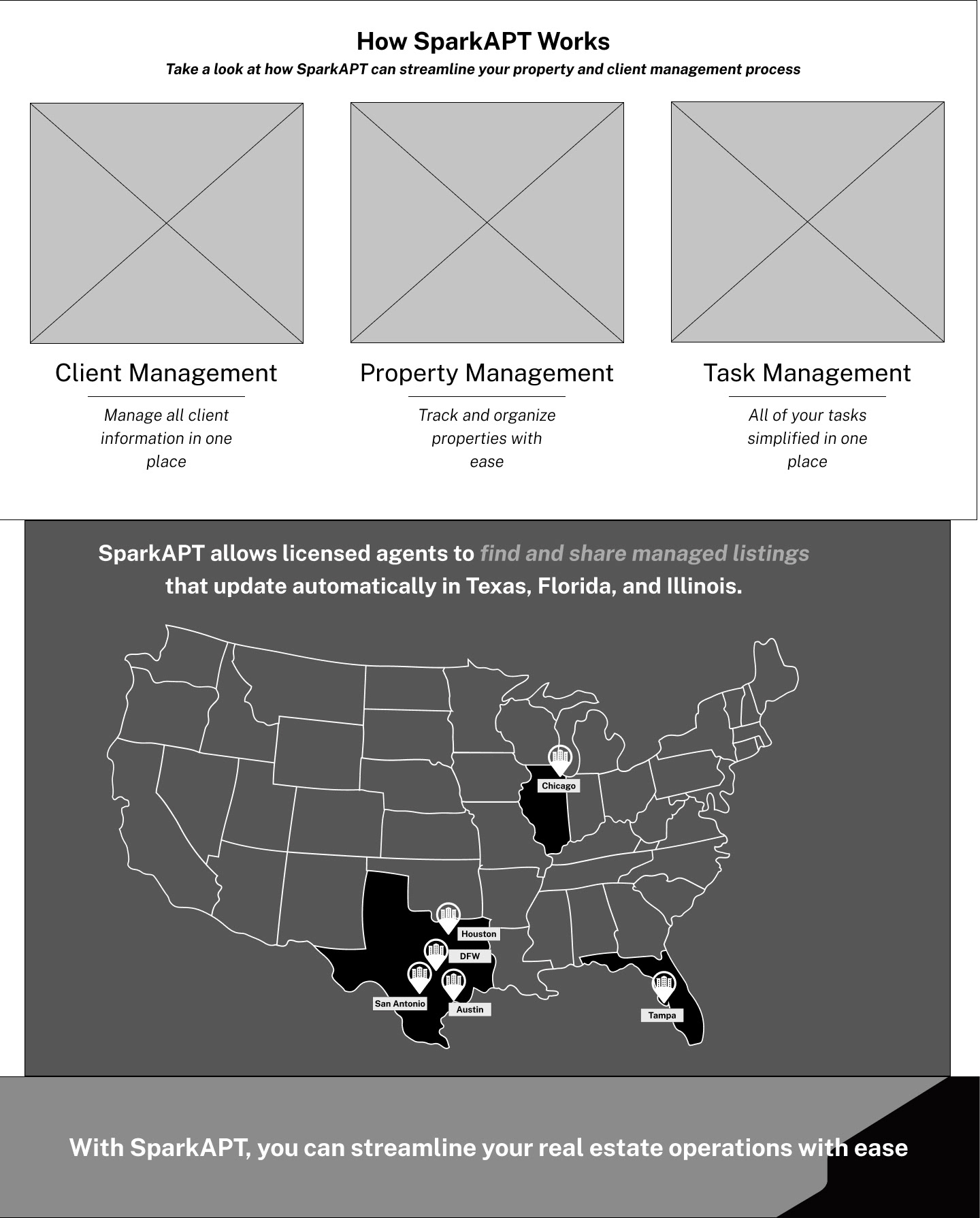
Fonction
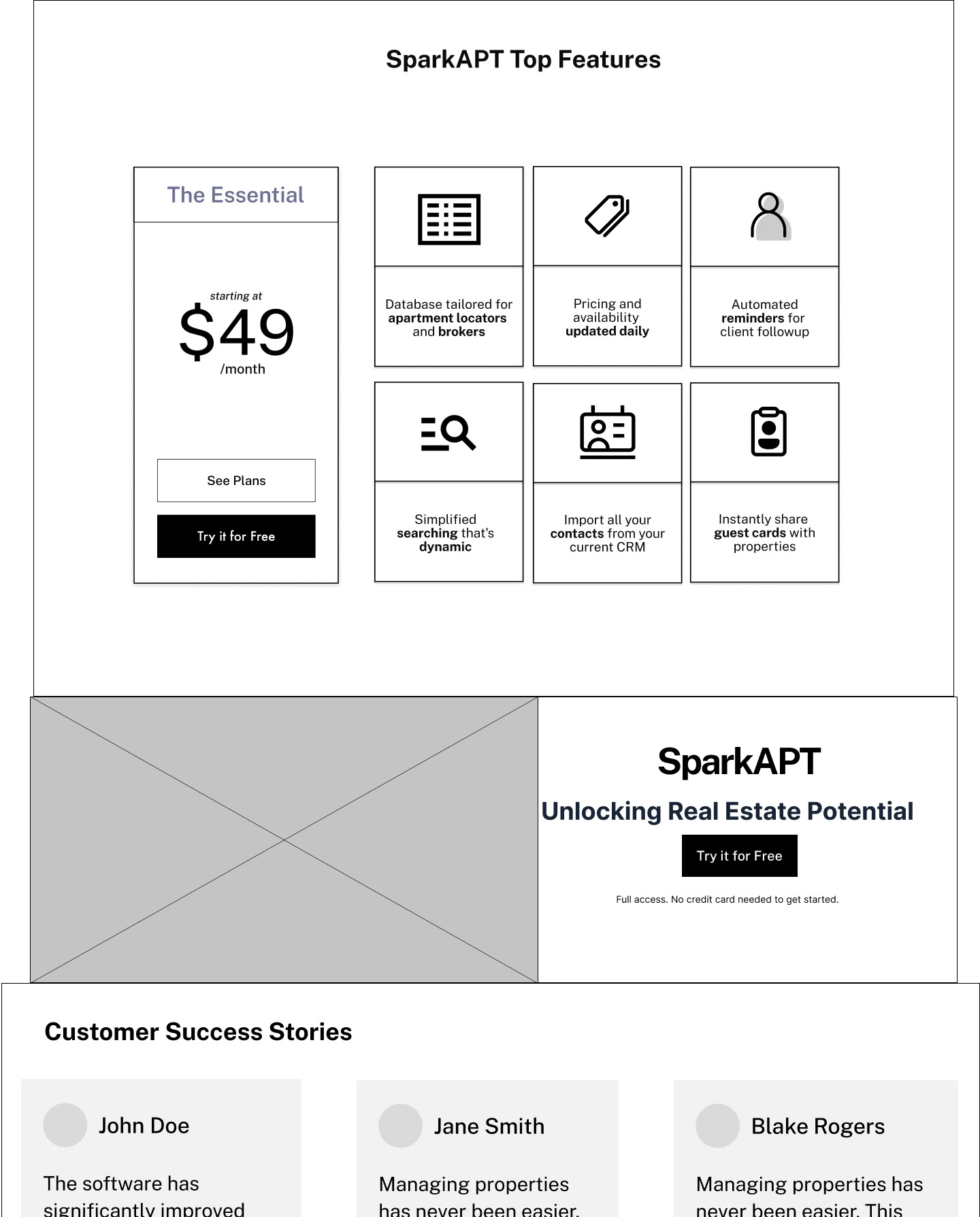
Features
The aim of redesigning the landing page was to develop an impactful layout that would grab the attention of new users and pique their interest to explore further. This involved incorporating details about the software along with fresh taglines not present on the original page.
The functionalities segment aimed to demonstrate the practical capabilities offered by the SparkAPT software solution.
Meanwhile, the features section aimed to use concise and clear language to describe the additional functionalities users could access with SparkAPT.
Onboarding Wireframes
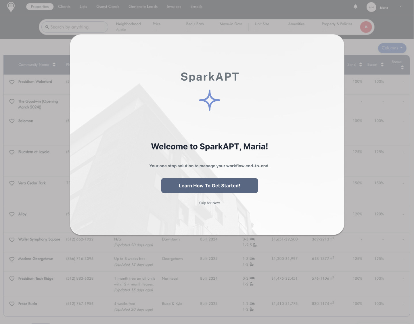
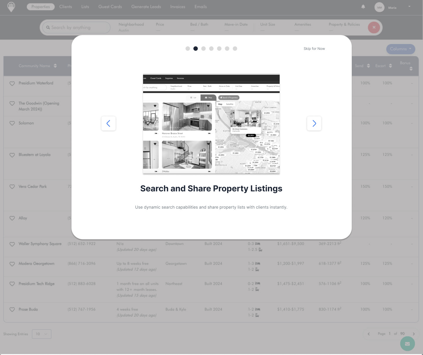
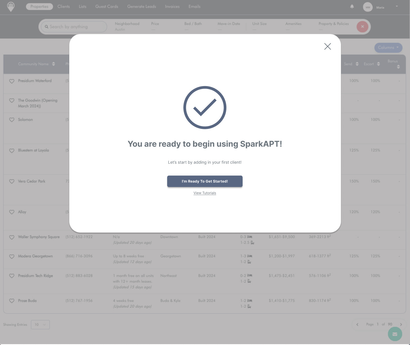
We aimed to develop an onboarding process for newly registered users, focusing on guiding them through the utilization and navigation of the features. This initiative aimed to provide comprehensive assistance in understanding the functionality and operation of the platform upon entry.
Usability Testing
We tested on the mid-fidelity prototype before designing any further to help us address the following objectives:
- if users can successfully complete given tasks
- if there is user confusion during website navigation
- capture feedback on the quality of information and layout
We conducted usability testing remotely with a total of 15 users using a hybrid approach of moderated testing over Zoom + Maze, and unmoderated only through Maze.
During the test, we asked users to complete 3 tasks:
- Browse landing page and features
- Review and select a pricing plan
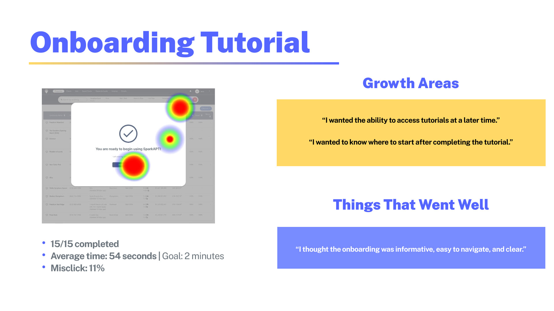
- Complete the onboarding tutorial
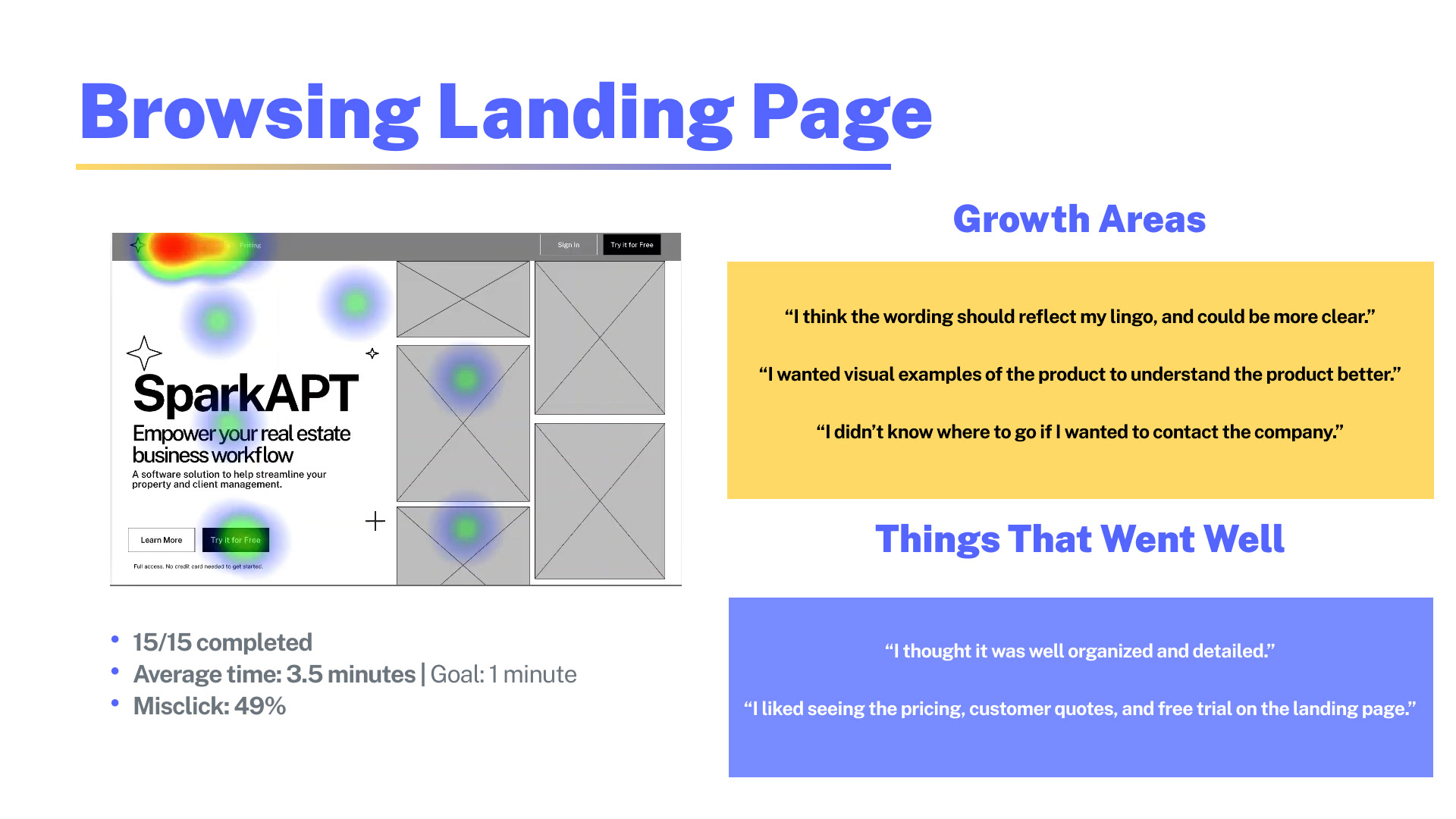
Browsing Landing Page: User testing revealed that it took an average of 3.5 minutes for users to navigate the landing page, surpassing our target of less than a minute. Feedback indicated a need for clearer language, additional visual aids, and a more straightforward method of contacting us. Nonetheless, users commended the organized layout, transparent pricing, customer testimonials, and the offer of a free trial.
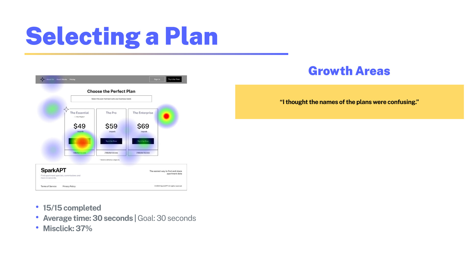
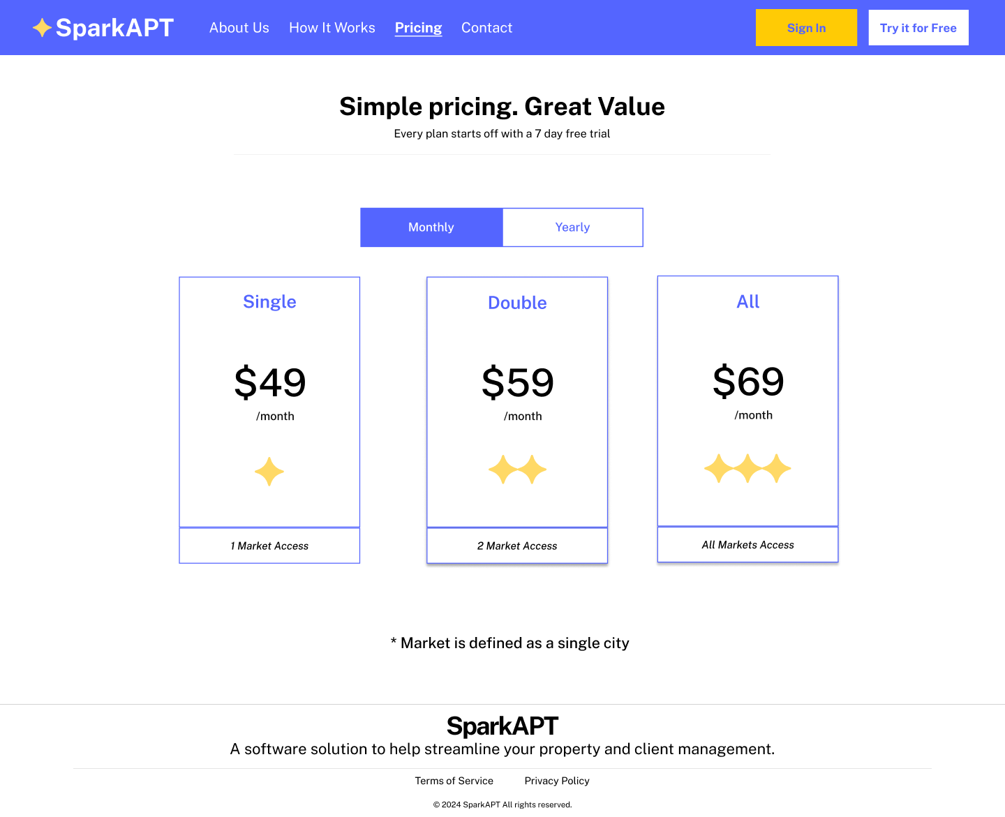
Selecting a Plan: The plan selection process, anticipated to take 30 seconds, met our goal; however, users found the plan names confusing.
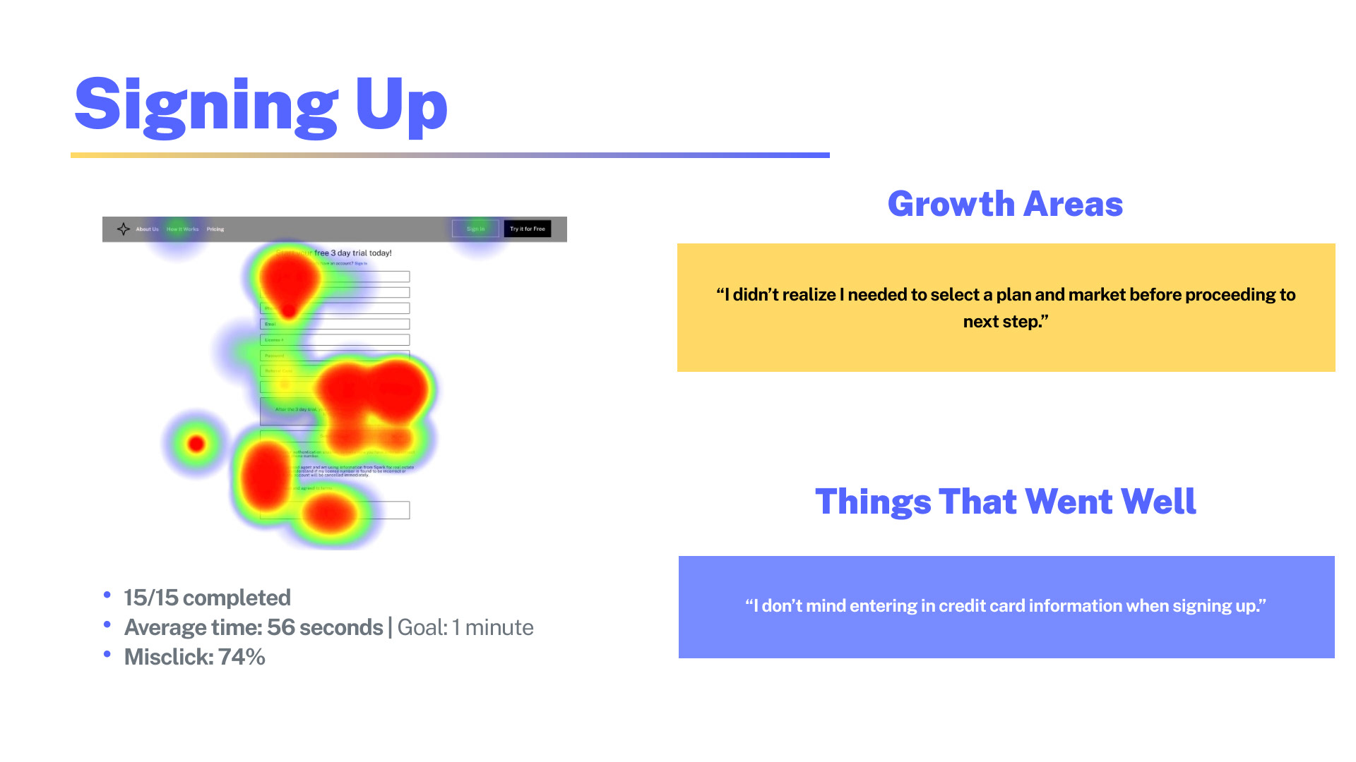
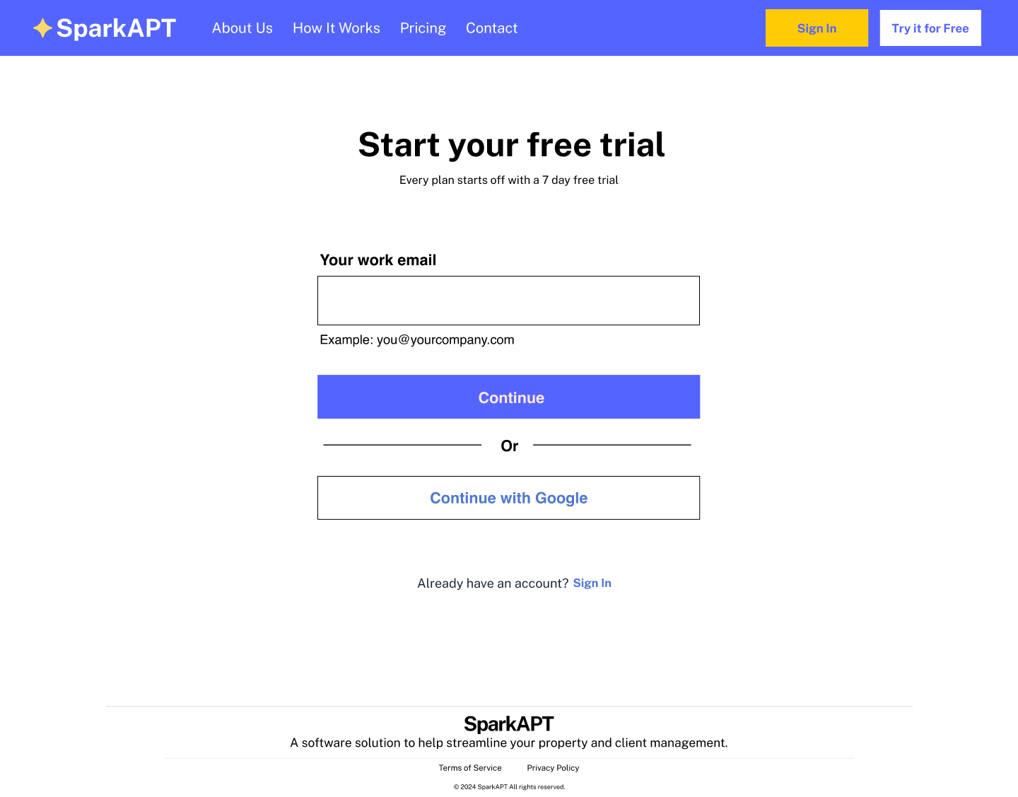
Signing Up: Despite sign-up taking less than a minute, users often experienced mis-clicks due to the complexity of the dropdown menu for selecting a market and plan. Nevertheless, users had no issue providing credit card details.
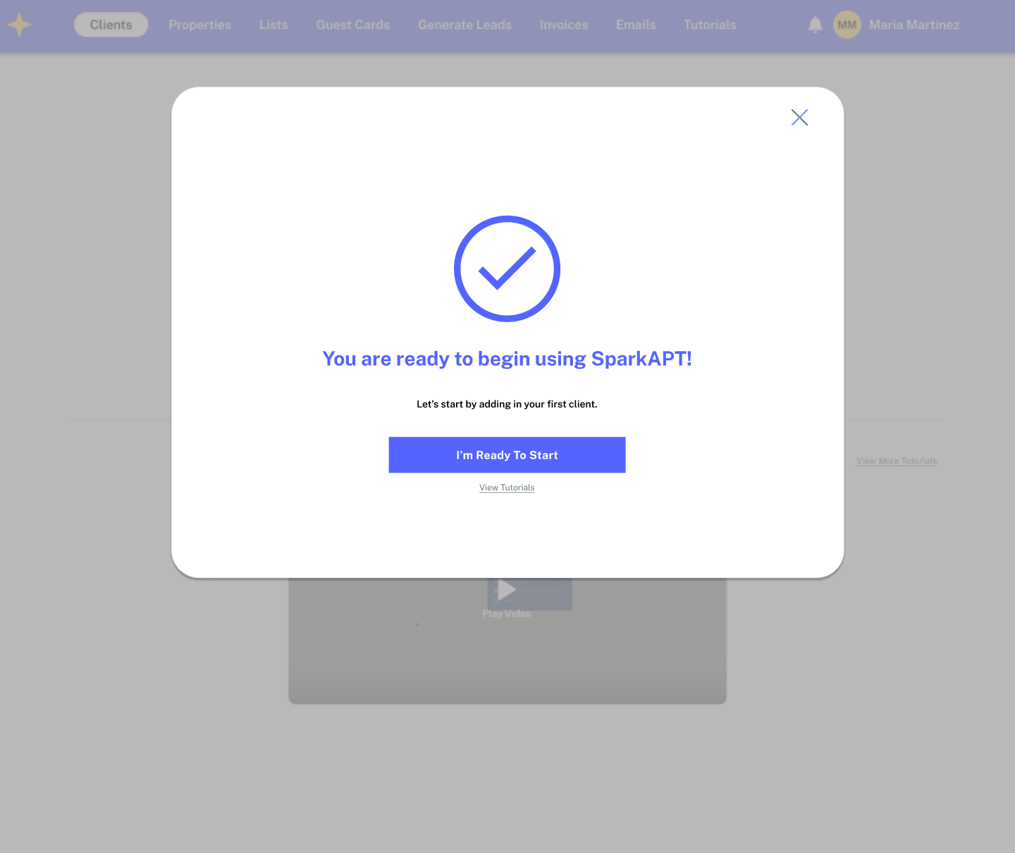
Onboarding: Users praised the onboarding process for its clarity and simplicity, although they desired the ability to revisit it later and requested more detailed instructions on utilizing features.
High Fidelity Prototype
We implemented user feedback from testing and gained alignment with our client on the refreshed design system to create our high-fidelity designs and prototypes.
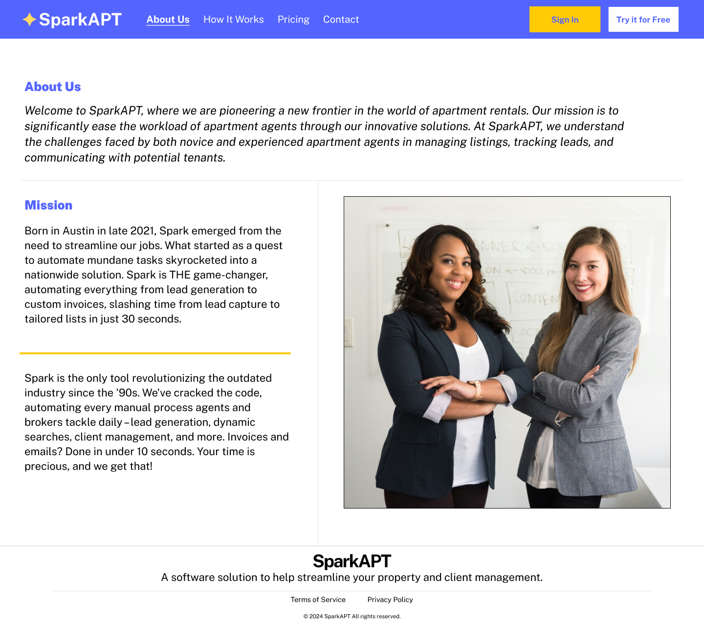
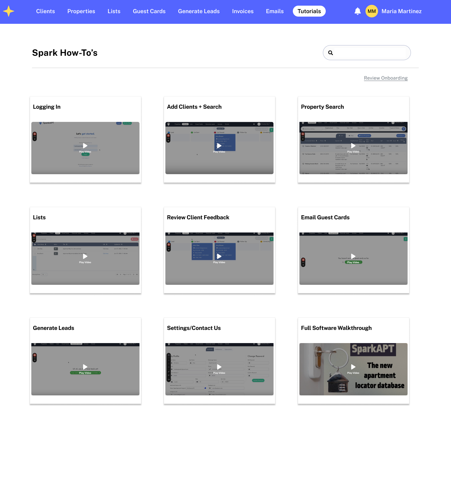
In our redesign, we prioritized visual appeal and user engagement by arranging photos consistently and incorporating GIFs for enhanced interactivity. The hero statement remained prominent, providing immediate clarity on visitors' goals. We refined the wording for a reflective tone and aimed to boost sign-ups by offering a comprehensive overview of platform functionalities, including property listing and client management. Spark APT's expansion across three major cities was highlighted, along with detailed features, pricing updates, and an FAQ section conveniently placed on the same page. Additionally, we introduced an "About Us" page for a personal touch, alongside longer tutorials and updated pricing options for user flexibility.
To facilitate user navigation and decision-making, we streamlined the onboarding process with a cleaner flow across multiple pages. Clear markers guided users through the process duration, allowing easy selection of desired city and payment plans. Post-registration, users received a detailed overview of platform features and functionalities, with the option to revisit tutorials or refresh their understanding. This comprehensive approach serves as our roadmap for enhancing the user experience and promoting increased user subscriptions.

Next Steps
Our 3-week sprint ended at this point of the high-fidelity prototype. New users, like Maria, are now welcomed to SparkAPT with more information, an onboarding tutorial, clearer empty states, intuitive direction on how to start using the platform, and an easily accessible tutorials page.
If we were to continue the project, here are some next steps our team would propose to tackle:
Conduct usability testing on the high-fidelity prototype to test the navigation and iterate based on user feedback.
Create a responsive mobile design for the Properties search page in the software, converting the layout from a fixed table view into a stacked table. Then, conduct usability testing on the initial design.
Explore a redesign of the existing software layout to ensure clarity for users when navigating and using features that exist once they are using the software.
During this project, I discovered a profound enthusiasm for designing with a focus on meeting the needs of both users and clients. This experience led me to actively support the interests of both parties while collaborating with the team to make decisions.


