Project Overview
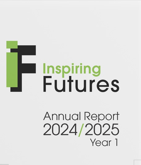
The Inspiring Futures Annual Report 2024/2025 was commissioned by INHA, led by Hamara and funded by the Youth Futures Foundation. The organisation approached me with a detailed Google Doc containing all written content and visual assets, seeking to transform it into a professionally designed editorial report that would communicate their mission with clarity, optimism, and credibility.
The goal was not just to design a brochure, but to craft a visual narrative that reflects the organization’s inclusive approach, showcases data and stories effectively, and establishes a consistent and trustworthy visual identity for future publications.
Client: INHA / Hamara
Format: A5 Print Report
Timeline: 3 Days
Deliverables: 20-page Print-Ready PDF +
5 Custom Illustrations
Format: A5 Print Report
Timeline: 3 Days
Deliverables: 20-page Print-Ready PDF +
5 Custom Illustrations
The Challenge
The brief presented several key design challenges:
Editorial Balance: Structuring a large volume of content within an A5 format while maintaining readability and rhythm.
Visual Harmony: Ensuring a refined use of negative space, typographic hierarchy, and colour contrast to achieve both aesthetic appeal and accessibility.
Consistency: Aligning visual tone across text, imagery, and illustration while adhering to the brand’s existing identity system.
Precision: Maintaining accurate year references, page alignment, and print-safe margins to ensure a flawless final production.
With only three days to complete the project, every design decision had to be intentional, blending efficiency, technical accuracy, and editorial finesse.
Design Approach
The design process focused on combining editorial clarity with visual storytelling:
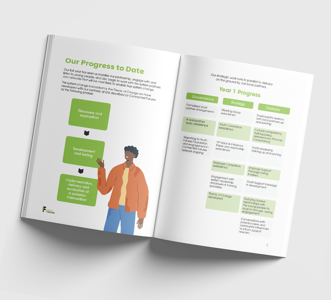
Content Architecture
I began by establishing a strong grid system and typographic scale, allowing the content to breathe while guiding the reader’s eye naturally from headline to body text. Each spread was designed to feel cohesive yet dynamic, creating visual rhythm through alignment, repetition, and controlled variation.
I began by establishing a strong grid system and typographic scale, allowing the content to breathe while guiding the reader’s eye naturally from headline to body text. Each spread was designed to feel cohesive yet dynamic, creating visual rhythm through alignment, repetition, and controlled variation.
Visual Identity & Illustration
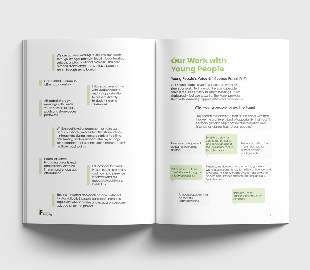
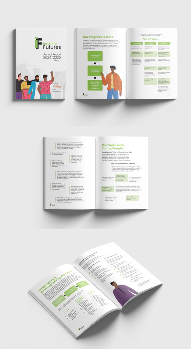
Using the brand’s existing green and black palette, I introduced five custom vector illustrations to humanise the data and add warmth. The characters were intentionally diverse to reflect the organisation’s inclusive values. Each illustration was strategically placed to support content flow, never competing with the text.
Using the brand’s existing green and black palette, I introduced five custom vector illustrations to humanise the data and add warmth. The characters were intentionally diverse to reflect the organisation’s inclusive values. Each illustration was strategically placed to support content flow, never competing with the text.
Typography & Colour Strategy
I used a clean sans-serif font pairing to achieve high legibility, supported by consistent line spacing and hierarchy. The colour contrast was fine-tuned to meet both aesthetic and accessibility standards, ensuring that key information stood out without visual noise.
I used a clean sans-serif font pairing to achieve high legibility, supported by consistent line spacing and hierarchy. The colour contrast was fine-tuned to meet both aesthetic and accessibility standards, ensuring that key information stood out without visual noise.
White Space & Composition
Special attention was given to the balance between text and negative space, an essential rule in editorial design. By allowing breathing room around blocks of text and imagery, the design conveys sophistication and trust — embracing the “less is more” philosophy.
Special attention was given to the balance between text and negative space, an essential rule in editorial design. By allowing breathing room around blocks of text and imagery, the design conveys sophistication and trust — embracing the “less is more” philosophy.
Collaboration & Iteration
The process involved two structured feedback rounds. I implemented client revisions with precision, maintaining design coherence while accommodating small textual and image adjustments. The result was a seamless, ready-to-print file that exceeded expectations.
The process involved two structured feedback rounds. I implemented client revisions with precision, maintaining design coherence while accommodating small textual and image adjustments. The result was a seamless, ready-to-print file that exceeded expectations.
Outcome
The final result is A5-format annual report that communicates professionalism, clarity, and purpose.
It combines editorial discipline with visual empathy, turning complex written content into an elegant, engaging reader experience.
It combines editorial discipline with visual empathy, turning complex written content into an elegant, engaging reader experience.
The client praised the layout’s clean readability, perfect balance of imagery and text, and its ability to convey the organisation’s mission effectively, all within a remarkably short timeline.
Delivered as a high-resolution, print-ready PDF, the publication now stands as a template for their future communication materials.
Tools & Techniques
Adobe InDesign · Adobe Illustrator · Adobe Photoshop
Grid Systems · Typographic Hierarchy · Print Production Setup · Illustration Integration · Accessibility Standards
Grid Systems · Typographic Hierarchy · Print Production Setup · Illustration Integration · Accessibility Standards
Reflection
This project reinforced one of my guiding principles: great design is invisible, it feels effortless, yet every detail is intentional.
As a designer, I see editorial work as both art and strategy, a balance of clarity, rhythm, and persuasion. Through composition, hierarchy, and restraint, I help organisations turn information into experiences that connect emotionally and intellectually.
Clients who work with me don’t just get a designer; they get a partner who understands how to translate ideas into structured communication, how to elevate a message through simplicity, and how to create designs that inspire trust and engagement.
Because in editorial design, as in branding, every page tells a story, and every choice matters.